

Most eco-friendly brands
choose conscience over luxury.
Nulight Candles needed both.
Nulight
Soy Candles
Nulight Soy Candles is a family-run candle company rooted in Northern California’s commitment to clean, intentional living. The challenge was to create a brand identity that balanced elevated luxury with the warmth and authenticity of a nature-focused, locally owned business. Every ingredient, from soy wax and essential oils to wooden wicks, reflected that philosophy, and the visual identity needed to do the same.


My Role
Self-initiated brand concept. I led the creative direction end-to-end — developing the brand identity system, packaging design, label illustrations, mailer box design,
and social media creative for their best-selling scents.
Identity
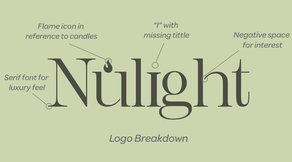
The logo needed to do more than look polished — it needed to tell a story. I embedded symbolic natural elements directly into the logotype, giving it visual depth without sacrificing refinement. A serif typeface anchored the luxury positioning while keeping the brand feeling handcrafted and local rather than corporate.
Color & Illustration
Green was the natural choice for the color system, but the goal was to make it feel intentional rather than expected. Every touchpoint — from label to mailer box — was unified under a consistent color palette and original illustration work, so the brand felt cohesive whether a customer was unboxing a shipment or scrolling through Instagram.


Packaging for a Candle Brand
For packaging, I leaned into recycled materials not just as a practical choice, but as a brand statement. The mailer box was designed to feel like it came from somewhere real — textured, considered, and far from the over-produced look of mass-market competitors.


